Friday 22 February 2013

Double Page Spread Research

This is the final part of my research on music magazines and this section is focusing on Double Page Spreads. Double Page Spreads are a feature in a magazine which consists of an article spreading across 2 pages of a magazine.


This is a double page spread of a magazine about 'The Vaccines'. A typical double page spread is mostly picture dominated, and as you can see on this DPS this is the case with a picture of the band taking up 3/4 of the page leaving a pretty narrow column for any text that needs to be written. There is only a 2 way colour scheme in this double page spread which is blue and black. Another typical convention of a DPS, is to start the article with a drop capital which has happened here with the huge J at the start. However it is not usual for an article within a DPS to have 2 drop capitals. This adds diversity to the article as not many other music magazines will do the same so this makes the magazine stand out to others. In my DPS I will be using my picture to spread across both pages and cover 3/4 of the whole 2 pages. I will be adding another colour scheme to my DPS so I have a 3 way colour scheme, in this example there is only a 2 way colour scheme of blue and black.


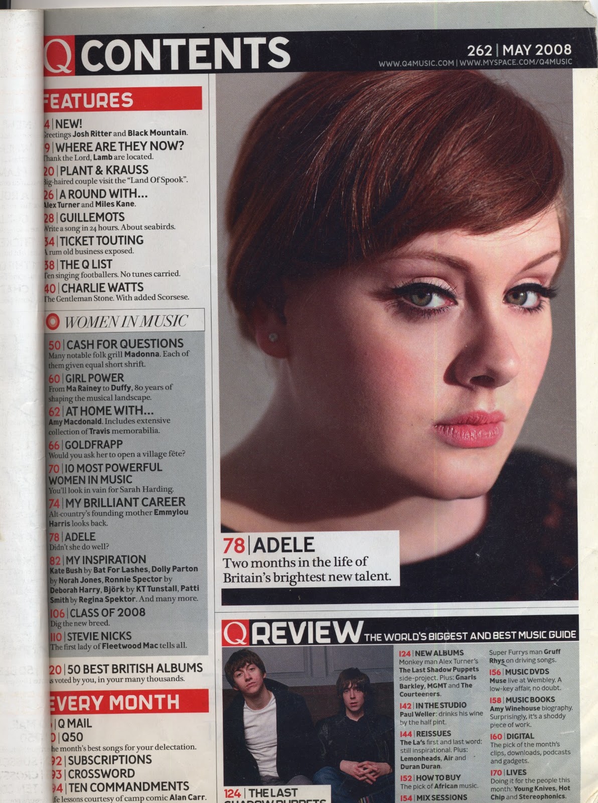
This is a DPS of the music magazine Q. This particular DPS is completely different to the NME one above as the main picture uses one half of the page and the other half is used for text. I like how Q has evenly balanced the picture with the text so that the article is not picture dominated. There is a 2 way colour scheme again for this DPS, the colours on this one are a lightened green and black. Also the article has one drop capital to start the article. Another convention within this DPS is an important quote from the article placed in the middle of the story. I will be including the important quote into my article because this is a really common convention within any type of magazine and it makes it look professional. The picture in this is a mid shot of George Michael however I have said that I will be using a picture that cover 3/4 of the whole of the 2 pages so I don't think that would be possible. I am definitely including a drop capital to start my article.


This is the second DPS from Q and it features the rap artist Jay-Z. The first thing that caught my eye was the sheer size of the red J in the middle of the article. I like this convention because it is unique to other magazines and it actually works because you can see the writing behind the J because the text is black. Another convention which has been typical of Q is to split the picture and the text in half so the picture is on one side and the text on the other.  This edition of Q has 2 drop capitals in the article, this is similar to the first DPS I analysed from NME. There is a 3 way colour scheme of red, yellow and black. I am going to use the 3 way colour scheme convention within my own DPS as this shows that I have made an effort with my research and challenged myself by doing extra work. The important quote is again displayed on the page but instead of it being mixed within the text it is on the side with the picture on it, this adds diversity to the DPS as not many other magazines would do this. I am thinking of doing this as not a lot of people will do this on their work and I will stand out.


This is a DPS of Florence Welch from the music magazine NME. This is a good DPS to analyse because the text and image are not split. The picture covers the whole of the 2 pages then the text is placed on top of the image where ever this space which is in the bottom right hand corner of the page. The article starts with a drop capital as all of the DPS' I have analysed have done the same. The colour scheme for this DPS has a very sleek looking design to it as the background of the picture is silver and so is the huge title which is impossible to miss. The use of black as well also shows the reader that the colour scheme is very sophisticated. This DPS is definitely picture dominated. With the style of this DPS having the whole picture covering both pages and the text placed on top appeals a lot to me because I said I wanted to have my DPS picture dominated. I like how the text is columned and I will somehow try to incorporate this into my DPS.


This is the final DPS I am analyzing and it is from NME and the article is about Lady Gaga. Just like the Jay-Z DPS there is a big letter covering the majority of article which seems to be a common occurrence in some music magazines. Another feature that I have came across before is the 2 drop capitals but they start different paragraphs and don't start the main article. This DPS consists of black, white and red as a 3 way colour scheme. The structure of this DPS is more organised than the previous on as the 2 pages are split in half to have different jobs to display different content. The 3 way colour scheme is a convention that I am definitely going to include within my DPS  and this is reflected in this DPS. I will be using drop capitals but only one at the start of the document and not more than one and in different places.


Friday 8 February 2013

Preliminary Task Evaluation

This is my evaluation of the preliminary task I was set which included making a front cover and a contents page for a school magazine. Overall I passed my tasked in the end, but it wasn't without its problems. I had to take so many photos because they were either out of focus or landscape instead of portrait, however I eventually got the ideal picture that I needed and used Adobe Photoshop to cut the background off the model and make certain tweaks to make the picture look better. My front cover looks a lot better than my contents page in my opinion, due to the fact that it has more content on and offers a lot more diversity. I also had to take more pictures to use for my contents page which also was a hassle because I had to take a lot of photos at different angles and get them all in focus. Overall though, I enjoyed doing the preliminary task as I was able to utilise my skills that I had learnt through previous lessons that were dedicated to learning skills in Adobe Photoshop and In InDesign.

Contents Page Research

As part of my research for my music magazine I also have to look at Contents Pages on certain music magazines. This is the area I need to work on the most in the terms of my own work. My contents page was not as good as my front cover for my preliminary task.


This is a contents page of NME and the style of the content page is blocky. It uses a simple colour scheme of black, red, yellow and white within the text. It only has one picture which is good because this means the page isn't picture dominated. With NME they are very helpful and user friendly with their contents pages as on the left hand side they have a band index for people who want to find out more about a certain band. The font at the top shows clearly what the page is all about due to the sheer size of it. There are no words on the picture that has been taken so the viewer can clearly see what the picture is of. I have to take this into consideration on my music magazine because in the preliminary task I had text covering my models picture which made the point of having a picture pointless because it would be hard for readers to establish what the picture is. There is a big use of subtitles within this contents page, this will be to separate stories and not bulk up the content to make it look unorganized.


This is my second contents page that I have researched and again it is a an NME contents page. Again on the left hand side it has the band index for those who want to find more about a certain band that is mentioned in the magazine. This is very user friendly. Again it uses a simple colour scheme of black, red, yellow and white within the text. In this issue I have realized that it does not actually state that it is a contents page which could be confusing for the reader. There are no words on the picture that has been taken so the viewer can clearly see what the picture is of. I have to take this into consideration on my music magazine because in the preliminary task I had text covering my models picture which made the point of having a picture pointless because it would be hard for readers to establish what the picture is.


This is the contents page of the music magazine 'Q'. This is the second magazine that I am researching about the conventions of a contents page.The first thing that I lay my eyes on was the huge and bold red title which clearly states that this document is a contents page with its big black font and the issue number on the opposite side of the document in the opposing colour of black which is white.The font type is very consistent within this contents page. It stays the same for most of the document, except for 2 subtitles. But if anything, this is good for the document as it offers a lot of diversity. This contents page is different to the NME ones as this contents page acts as like a double page spread as well as a contents page. This is good as the content can be spread out in different areas of the page. This is a well presented document, but this is not the preferred style of document that I would like to imitate for my document personally. However I like the amount of pictures on this contents page and I also like the page number being stated on the pictures clearly so everyone can see what page to visit. This is a dynamic version of a contents page as it is also has a double page aspect to it. I would not like to do this as I believe it just adds more work to do and I don't think i would have the time.


This is the fourth contents page that I am analyzing and the magazine is again 'Q'. This particular contents page is a lot calmer and more structured than the previous one. This contents page is mainly picture dominated as the picture takes up a lot of the area of the page. This portrays that the main story of the magazine will be about 'Adele'. The colour scheme is very basic yet it look pretty professional, the main colours are white, red, black and grey. The stories are all very structured together in different colour boxes so that it is easy for the audience to navigate around the contents page. The font type on this contents page is fairly consistent as it only changes for one use of Italics. Overall I like the look of this contents page as it is suited for the type of contents page that I will be using on my own magazine when I create it.I am going to have my magazines contents page picture dominated as I think too much text bores the reader so minimal text will be what I aiming for in my own document.


This is the final contents page that I will be analyzing and the magazine of choice is 'Q'. The first thing I see is the amount of pictures within the document. The style of this document is most definitely picture dominated as there are four fairly big pictures and all of the text is in one narrow column so its not at all a blocky style document. All of Q's colour schemes are fairly similar in the way that the magazines always have a red strap line across the top of the page and the red underlining of the black subtitles of the descriptions of the article or story. This suits the style of magazine I want to create perfectly because of the picture dominated style of the document. I would also like to have my text within one column and this document really recreates this and is able to give me an idea of about how it will look when I try and do this.

Front Cover Research


As part of my research I have been instructed to find 5 front covers of my chosen music genre and annotate there codes and conventions. My chosen music genre is Indie.                                                                                                                                                                 


NME is a Indie music magazine and is very popular within the UK.The first convention I would like to approach is the 3 way colour scheme within the text. This copy of NME uses a 3 way colour scheme within the text and the colours are white, yellow and red. The second convention that caught my eye ... literally. Its the eye striking font which blew me away when I first laid eyes on it. The name of the band and the sub title are all in massive font in order for the reader to gain an understanding, not just for the bands name but also for the genre as well. A title can tell a lot more things than just the name of the band. The photo on the front cover has also interested me. Most magazines either have 1 person on the front cover or 3 people, but I have noticed that NME have took the lead singer of the band and put him in 3 different places along the front cover so it looks like 3 different people when its the same person.


This is another NME magazine with Jake Bugg on the front cover. If no one knew who he was by the picture itself then the big, bold title surely gives this away. This copy of NME, uses a 4 way colour scheme within the text instead of the previous copy which had 3 colours within the text, the colours are white, yellow and red and black. The front cover also consists of one person in the picture, and as I said in the last magazine, its usually either one person or 3. This is a great contrast of how the theme of the magazine changes depending who is on the front. All the font is the same throughout the whole of the front cover, no matter how small or how big the text goes the actual font type does not change.


    This is the third and final NME magazine that I will be researching for my front covers. The Band on the front of this edition of NME is the Arctic Monkeys. The Arctic Monkeys are ridiculously popular within the UK but even a person who had never heard of the band before would now know who they are due to the bulging yellow font which stands out extremely well. This copy of NME, again, uses a 4 way colour scheme within the text,this is the same as the previous copy of NME which I annotated with Jake Bugg on the front cover, the colours are white, yellow and red and black. The font has diversity within the front cover as it is not just one font type. This differs at the top right hand cover of the front cover where it says ' PREVIEW ISSUE' in block capitals in the font type 'Times New Roman'. I think that this edition of NME is a special edition and the fact that most of the magazine will be about the Arctic Monkeys the magazine have went against most common conventions and put 4 people into the front cover when it is usually 1 person or 3 people.


I have decided to add another magazine of the same genre but a different magazine completely. This magazine is called 'Q'. The band on the front of the magazine are called 'Kasabian'. This magazine and the band are very popular in the UK. This edition of 'Q' magazine uses a 4 way colour scheme. These 4 colours are gold, black, white and red. The font types are different in this magazine. The main title which reads 'KASABIAN' is more of a fun and bold font. However the other font type is 'Times New Roman' which is a more formal type of font for the reader. This magazine has also went against the typical convention of having 1 person or 3 people on the front cover. This shows that 'Q' is willing to be out of the ordinary in the market to sell the magazine.


This is the final magazine of my research on magazine front covers. Its another edition of 'Q' with Noel Gallagher on the front of the magazine. This edition of 'Q' uses a 4 way colour scheme again, the colours that are used are gold, white, red and black. The font type on the left of the front cover is more formal than to the font in the column on the right. The overall feel of this front cover is a relaxed cover and easy to navigate.

Wednesday 6 February 2013

Codes and Conventions of a school magazine


Codes and Conventions

Colour Scheme                                                                                   

Most magazines use a 3 way colour scheme. This means that there should only really be 3 colours to the magazine. The 3 colours that are used are pink, yellow and light blue. By sticking to this convention this enables the magazines to look professional and not rough. The picture also contrasts the colour scheme as the pink folder the girl is holding goes with the pink text, this also happens with the double yellow lines on the road with that blending with the yellow text.

Font

There are 2 types of font on show in this school magazine. One type of font is relaxed but also quite fashionable so it isn't bland and boring. This type of font makes the reader attracted to it. The other type of font is used within the title of the magazine. Its really bold and old fashioned to add some diversity to the document. And also the sheer size of it is unmissable so whoever looks at it is instantly drawn to the title.

Main Image

The main image of a school magazine must be relevant to the content that will be inside it. So the main image of this magazine is very relevant as they're students and they attend the school that the magazine is talking about.

Audience

As this is a school magazine it is been shown to young students and potentially parents so the content within the magazine needs to be appropriate and calm stories, nothing that will cause controversy. 

Tuesday 5 February 2013

Content Page

I have just finished my contents page for my preliminary task in my own time and I made some little tweaks to the contents page. As you can see I kept the same colour scheme and background colour as the front. However I changed the colour of one of the texts as if I had white it would contrast on the models face and it would be difficult to read so I put a bright and powerful colour on which is red so the text is readable and it stands in. I also had to move the picture of the model into the corner of the template on Adode InDesign because there were still colours coming through underneath it where there was space.


This is what I mean about moving the picture from this position to into the corner, you could see colour from the background underneath him, this needed to be changed as it didn't look professional.

Checking my progress

This lesson I have been checking where I am up to in my work. There were certain things that I had not done and which could potentially bring my mark up. Mostly things like putting Images of my work on Adobe InDesign into my blog so that people can actually see what work I have been doing.

Friday 1 February 2013

Gaining a greater understanding of a music magazine

Today's lesson has been a bit of a change as we have strayed away from the computers. Well ... until now of course. The lesson started off with a group task and the task was to draw the chosen music magazine but only one person could describe the features of the magazine and at the end of our allotted time we compared the real magazine with our drawing. They looked nothing a like. The whole point of this activity was to find out the codes and conventions of a music magazine and to be honest it helped quite a bit. I gained a good understanding of how many colours are involved and the text justification.