Wednesday, 8 May 2013
Wednesday, 24 April 2013
Final Cut - DPS
After my rough cut deadline I had acted on the feedback that was given to me from my teacher.

Final Cut - Contents Page
I acted upon the feedback given to me by my teacher from the rough cut deadline for my contents page. I had the photo of a model with his back turned to the camera on my contents page and I was not allowed this so I took separate pictures and changed the layout of my contents page completely.


Final Cut - Front Cover
After feedback from my teacher from the rough cut version on my front cover i decided to act upon the feedback given to me. I was told to take the gradient off and use different fonts to follow the conventions of my style models.


Choosing my final fonts
When acting upon feedback on my rough cut I was advised to change the fonts on my front cover. So I visited 'DAFONT' which is a website which shows the user hundreds of thousands of different fonts and font styles. I wanted a Sans Seriff font so my font had no little flicks coming off the letters and they were straight cut. Once I had searched the website for the fonts I wanted, I decided on the fonts, 'Bebas' and 'Bell Gothic Std'. I then had to download them onto my system so I was able to use them within InDesign.


This is what the fonts look like when they are applied to my front cover. They look so much more professional compare to my other font choices and I am absolutely delighted that I did the research and acted on the feedback that was given to me by my teacher.
Tuesday, 26 March 2013
Final Rough Cut - DPS
The last bit of criteria to do for my project was to make a double page spread. A double page spread is an article that stretches across two pages usually with a picture involved. A music magazine would include a double page spread when a big story is being covered either by a band or single recording artist. This is my rough cut version.


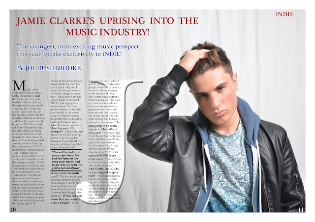
The double page spread was the hardest to execute because of the type of picture I had to take in order to get the text columns in the right space so I had to get my model to stand on the right hand side of the canvas so there was space for the 3 columns of text. After trying this I eventually got the right shot. Then I was able to start adding the columns in. The requirement was 3 columns to insert text in. I have put the page numbers at the bottom right and left hand of the page. I had to change the colour of number 11 as the jacket is black so I changed the font to the colour white so it stood out. I have put a title for the article which is the most basic and common convention of a DPS. I have also used a drop capital which is a big capital letter to start the article off and then the text drops down about 5 font sizes to normal writing size. In the middle column I have placed a quote from the article. This is a common convention and the quote is usually the most memorable or the most important. Overall I am very happy with the way my DPS has turned out after all the effort of switching software to get the right effects.
Final Rough Cut - Contents Page
The contents page is the second criteria after making the front cover. It displays the features within the magazine and is easy to read for the audience. I used my contents page research to build a structure for my actual contents page and this gave me a basic outline of what to put and where to put it.


This is my final rough cut of my contents page. I have used a range of colours within my contents page. However I did stick with the maroon title which fits so well with the style of my magazine. I have used a promotional offer at the bottom right hand side of the page which I have seen so many times on my research. I have included a banner at the bottom which displays information in a light bright turquoise. I have used 2 pictures within my contents page as on my research I found that it is a basic convention to have more than one picture on a contents page. I have also carried on the theme of using a gradient background with the white starting on the left and slowly fading into a light grey which then transforms into a jet black as it stretches across the screen. The numbers on the right of the articles is an unusual convention so I decided to add it as a unique touch on my coursework.
Subscribe to:
Comments (Atom)