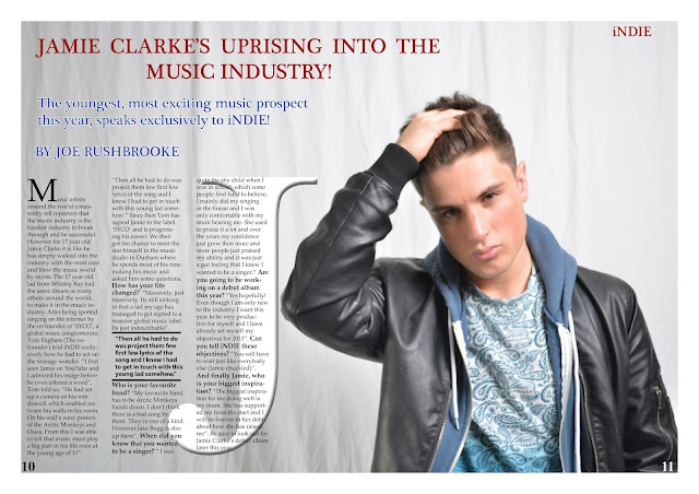
After my rough cut deadline I had acted on the feedback that was given to me from my teacher.
I am using this blog in order to update information and research about my AS Media Studies Coursework.
Wednesday, 24 April 2013
Final Cut - Contents Page
I acted upon the feedback given to me by my teacher from the rough cut deadline for my contents page. I had the photo of a model with his back turned to the camera on my contents page and I was not allowed this so I took separate pictures and changed the layout of my contents page completely.
Final Cut - Front Cover
After feedback from my teacher from the rough cut version on my front cover i decided to act upon the feedback given to me. I was told to take the gradient off and use different fonts to follow the conventions of my style models.
Choosing my final fonts
When acting upon feedback on my rough cut I was advised to change the fonts on my front cover. So I visited 'DAFONT' which is a website which shows the user hundreds of thousands of different fonts and font styles. I wanted a Sans Seriff font so my font had no little flicks coming off the letters and they were straight cut. Once I had searched the website for the fonts I wanted, I decided on the fonts, 'Bebas' and 'Bell Gothic Std'. I then had to download them onto my system so I was able to use them within InDesign.
This is what the fonts look like when they are applied to my front cover. They look so much more professional compare to my other font choices and I am absolutely delighted that I did the research and acted on the feedback that was given to me by my teacher.
Subscribe to:
Comments (Atom)


